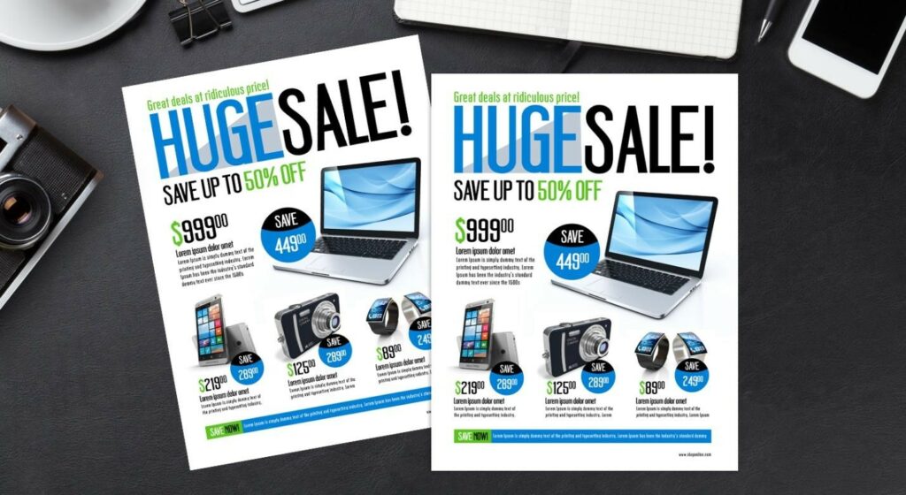
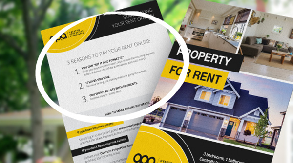
Despite a huge variety of advanced marketing techniques and modern advertising strategies, flyers remain tried-and-true marketing tools lots of business owners use for promoting their entrepreneurial ventures. And in today’s post, we’re going to cover how to design a great flyer for any occasion to promote your business.
Start with a strategy
Designing an amazing conference flyer, charity flyer, concert flyer, or any other kind of flyer could be the secret to boosting your event or promotion needs. But creating a great flyer actually doesn’t start with design. It starts with a well-thought-out strategy.
#1 Determine if a flyer is the right promotion tool for your campaign
First, you should determine if a flyer is the right promotional item for your initiative. What goals are you pursuing? Are you promoting something specific within your business or making an overall brand awareness play? If you’re not clear on the purpose of your marketing effort, you can end up with an unfocused design that is destined to migrate to a recycling bin.
Flyers are particularly good at promoting events and driving foot traffic. So, take one more look at your marketing plan and double-check that your designing a flyer is that tool to achieve your business goals.
#2 Determine basic information for your flyer
Next, you should determine some key information for the flyer you aim to design. Of course, the ever important questions of Who? What? When? Where? and Why? apply here. But take care to be very specific with your answers. Identify your target audience, as well as their tastes and preferences. Not only will this help you reach the right people, but also hook their attention, tap into their sentiments, interests, etc. Next up, you should decide on the form of your message. You want to opt for the simplest yet most enticing wrapping for your message.
Finally, you should answer the question of what your target audience should be thinking or feeling after reading your flyer. And what action do you want them to take once they’re done reading? Even if you’re just focusing on brand awareness, have a clear call to action (CTA). Be specific and straightforward with your audience. If you want them to follow you on Instagram or check out the recently published promo video on your blog, just ask for it!
Asking deeper questions than the Five Ws will help you get crystal clear on the information that’s essential to your flyer.
#3 Use bullet points
Don’t be afraid of bullet points, but don’t rely on them too much either. On the one hand, bullet lists can be a great way to relay rapid-fire information. But if you go overboard with the number of bulleted points, your flyer may risk feeling more like a grocery list and less like a professional promotion item.
Visual Design
After you have your messaging strategy in place, you can turn your attention to the actual visual design of the flyer. If you have a brand guide for your company, start there. If you’re promoting an event with unique branding, you can use that as your jumping-off point. Choose your colors and brand elements. Also, keep in mind if your flyer will be seen in color or in black and white.

You might know what role hierarchy plays in all kinds of design. So, if you want to put together a visually appealing flyer, you should figure out in what order you want to present facts to your viewers so that they absoft the information more effectively. Good flyer design would incorporate visual elements and copy elements in a clear hierarchy of importance that guides the readers’ eyes quickly over everything they need to know.
It’s a good idea to look at other flyers whose design you find attractive and effective in communicating important messages. Look at how they organize the information, use imagery, and express the CTA. Good inspiration coupled with good answers to the questions we talked about earlier will help you create a clear design request and create an amazing flyer.
Proofreading
Once you get the flyer design back, be sure to proofread. Read it out loud, get a friend to read, and triple-check it. You’re not just looking for correct spelling and refined stylistics, but also for information that may have been left out or for unspacing in layout that might mislead your eyes.


